

WARTO new identity
In 2022, WARTO Communications Agency made the first global rethinking of the agency’s identity: completely changed the color scheme and decided that the word «WARTO» itself is authentic, Ukrainian, meaningful, so can be an independent symbol and logo.
We lived and worked with this updated identity for more than a year, and all this time we were wavering — does it correspond to the spirit of WARTO, our values? Then we got an insight: the word should complement the same authentic, meaningful and unique symbol, which will strengthen the meanings that were embedded in the name of the agency, emphasize our trendiness and modernity, and show the connection with Ukraine.
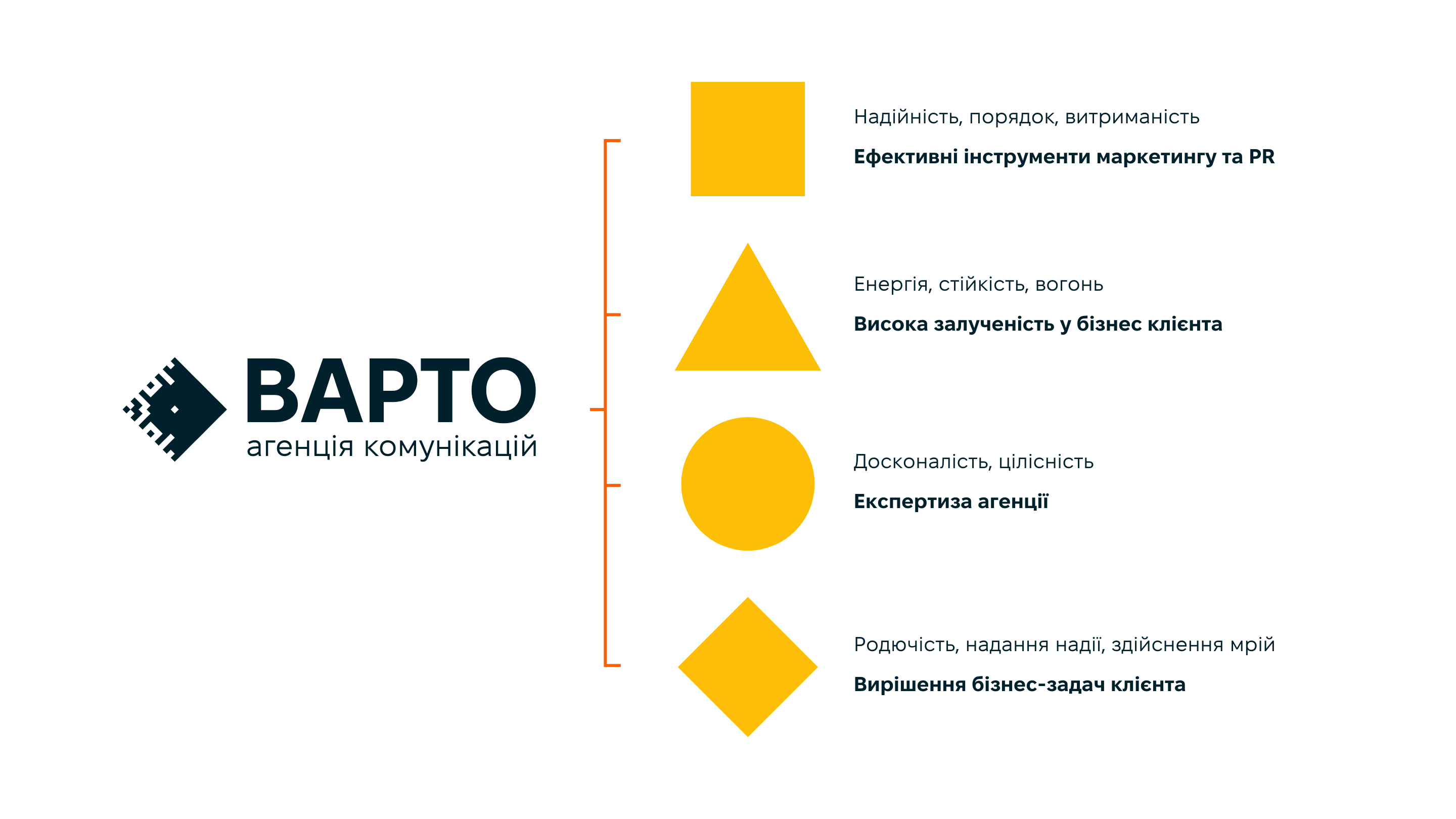
To find the best combination of traditional Ukrainian symbols and modern design, the agency’s team conducted a large-scale study of folk art motifs, particularly embroidery. The new WARTO trademark combines four archaic symbols — rhombus, circle, square, and triangle — often found in Ukrainian traditional art.
The combination of these four symbols in the logo refers to the working approach of the agency team: effective marketing and PR tools, implemented with high involvement and expertise of the agency, to solve the client’s business problems.
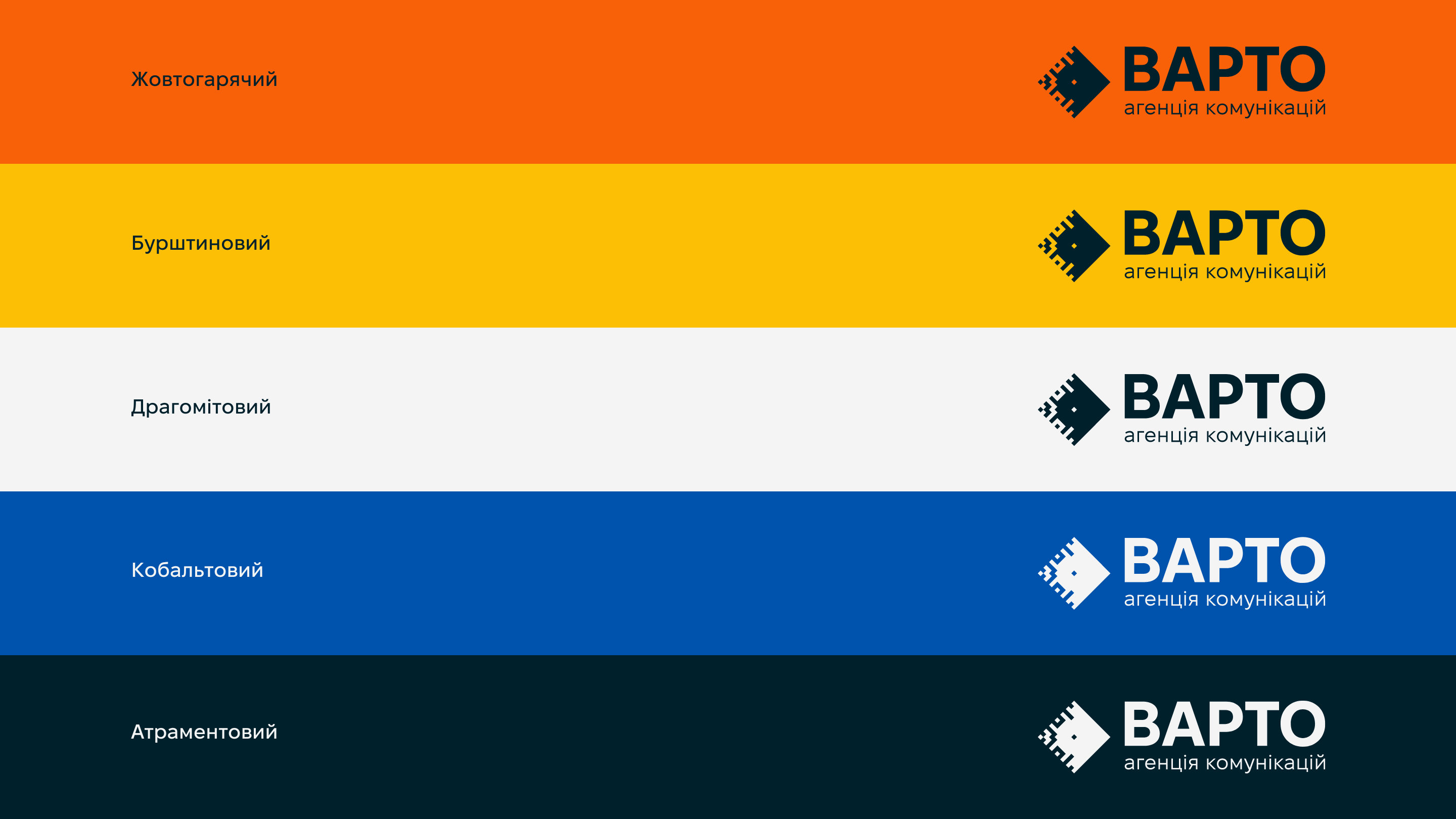
We also selected the new color palette inspired by samples of traditional art — embroidery, pottery, carpet weaving. The names of the shades refer to unique Ukrainian words.


 Copy link
 facebook
 WhatsApp
 Twitter
 instagram
 telegram
