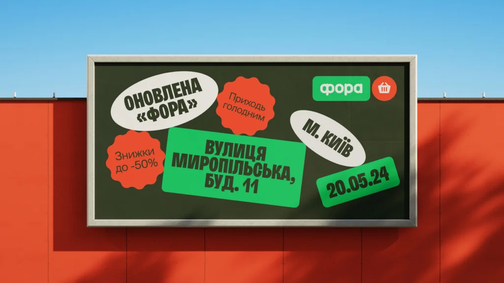
Rebranding of the Fora grocery chain
The creative agency Taktika carried out the rebranding of the Fora grocery store chain. Fora is a neighborhood grocery chain that has been operating in Ukraine for over 20 years and includes more than 340 stores. Recent changes in the country pushed Fora to adapt its strategy. The company revamped its approach by categorizing its stores and reinforcing the brand’s position of «care in action», staying true to its mission of providing all essential goods conveniently nearby. These strategic changes are also reflected in the brand’s updated visual style.
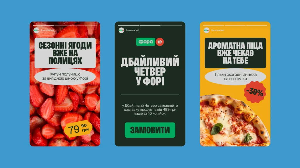
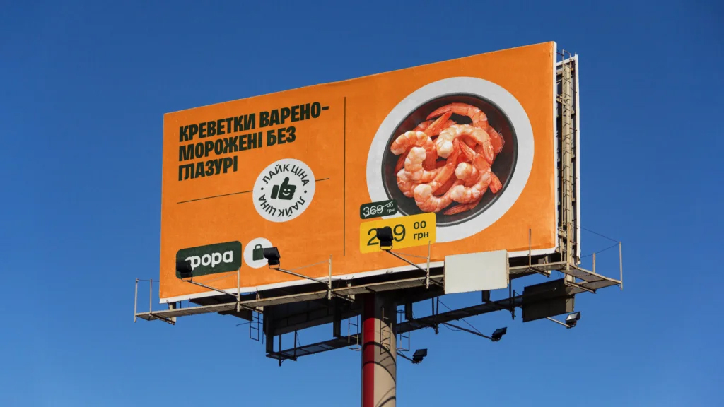
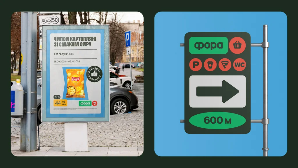
The design of the Fora chain has been modernized to align with current trends and better represent the brand. Taktika refreshed the brand’s identity by developing new branding elements, including updated layout principles for all communication channels, from storefronts to social media.
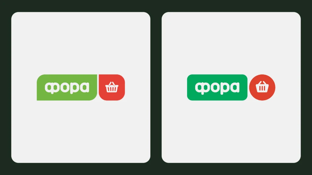
The logo was updated while maintaining recognizability, and the brand’s main colors – green and red – were revitalized, with the addition of purple, yellow, and blue. New accent fonts were also introduced, making the design look more modern and communication clearer. Taktika also created playful illustrative patterns and tags like «Come hungry» and «Something tasty and warm».




 Copy link
 facebook
 WhatsApp
 Twitter
 instagram
 telegram
