

UX/UI design for Sergiy Prytula Charity Fund
Lazarev.agency product design agency and Brights software development company conducted a redesign of the website for the Sergiy Prytula Charity Fund. Among the main tasks for Lazarev. were:
- create a website that serves as the main hub where people can find necessary information about the fund, its processes, view news, reports, and purchases;
- unite the categories of military and humanitarian aid on one website;
- improve user interaction with the fund’s website and encourage people to donate both within Ukraine and internationally.
They conducted an in-depth analysis of the website’s analytics, examined the functionality of the website, as well as the social media presence and comments left by people. They also analyzed direct and indirect competitors, and conducted surveys and interviews with military personnel, volunteers, and businesses looking to collaborate with the fund, as well as with Ukrainians who make charitable contributions. All this information was transformed into ideas to make people’s interaction with the fund as simple as possible and to encourage Ukrainians to support the charitable initiatives of the organization.
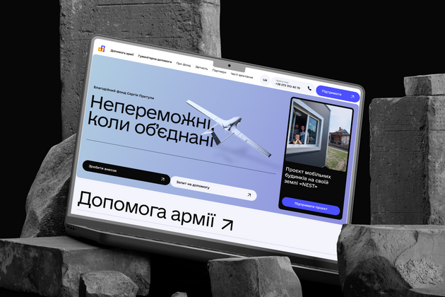
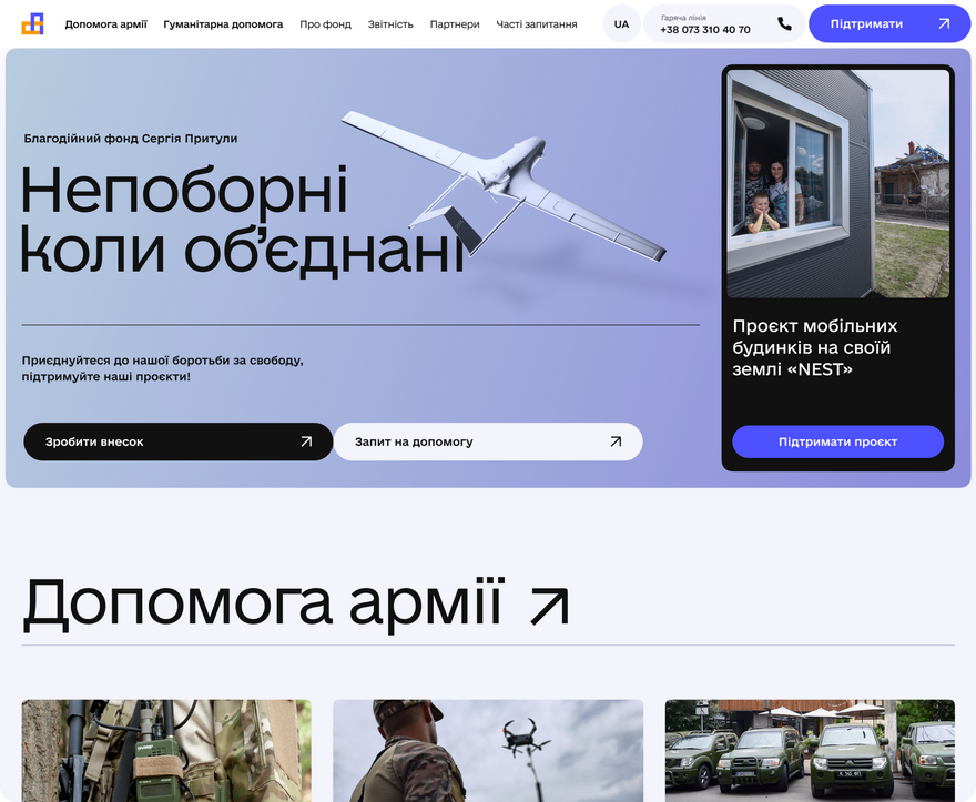
First and foremost, the revamped website became a platform that unites the two main directions of the fund’s activities — military and humanitarian aid. The main page welcomes visitors with a 3D model of the popular Bayraktar drone, large buttons that encourage visitors to make a donation or request assistance. The audience can also view the current fundraisers of the fund and support them with Ukrainian hryvnya or other currencies.
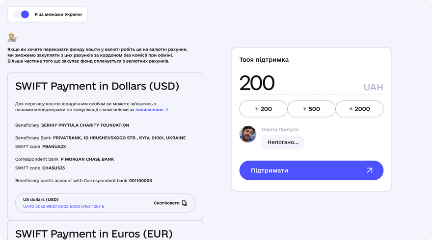
Additionally, the star of the financial aid web page is an interactive widget that they created to encourage people to donate and simplify the process of transferring funds. Its special feature is that it responds to any amount with a personalized message from Sergiy Prytula.
The «Partners», «Projects» pages were updated, and a «News» section and a «Questions-Answers» section were added.
Their approach to the visual design of the website was built on universality and simplicity. This means that all content should balance between being structured, readable, and attractive.
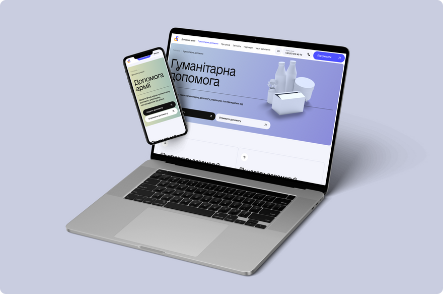
It was also important for the website to load as quickly as possible, regardless of the internet speed and the type of device. After all, the people who need to contact the fund are military personnel and volunteers who may be in areas where there are connectivity issues. Therefore, they filled the website only with essential content and avoided using an excess of images, animations, and other elements that could potentially slow it down.
This doesn’t mean they’re completely absent. Their team developed branded 3D models that represent specific sections of the website, such as humanitarian aid, military aid, reporting, and so on.
 Lazarev.agency

 Brights

 Copy link
 facebook
 WhatsApp
 Twitter
 instagram
 telegram
