


12 gnome for peat
BrainTank created an identity for the company Rozhnyativ Torf, which is involved in peat extraction..
The agency has never dealt with creating identity for such a business before. However, instead of seeing it as a challenge, they saw it as an opportunity to explore new possibilities. Thus, the experiments began. Putting ourselves in the shoes of consumers, the team answered the question of «how it should look» on their own.
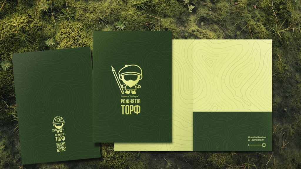
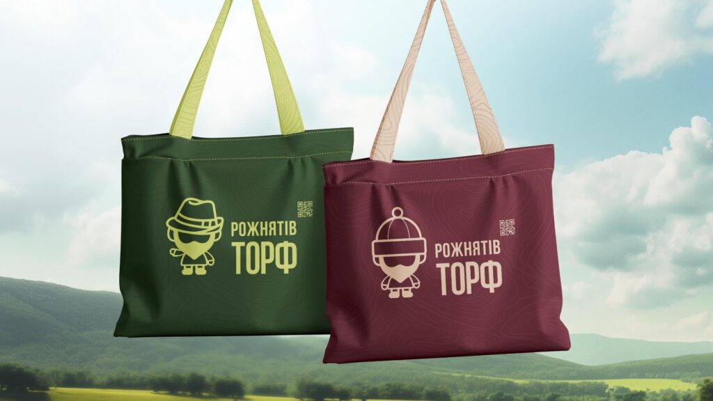
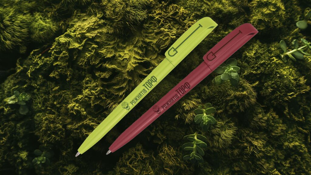
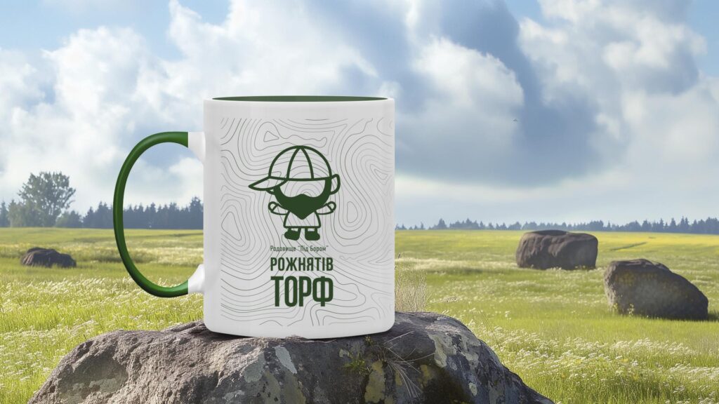
The team explored numerous options for a potential logo, from more conservative to unconventional ideas, imbued with meaning relevant to this industry. Consequently, the final creative decision was to create a brand hero — the Gnome.
The agency shattered the conventional belief that «serious and heavy» industries cannot have cool and unique identities by giving this product a vivid and apt image that will certainly stand out among its competitors. After all, every «yield,» regardless of its nature or industry, deserves stylish visualization.
They chose green as the primary color for the identity, as it perfectly emphasizes naturalness. The additional color is red-brown, visually reminiscent of the natural resource — peat.
They based the pattern on topographic lines of maps, reminiscent of the earth’s relief. Once again, a direct reference to the brand’s product — peat.
The agency believes that every business can be interesting, regardless of its identity — whether it is a peat extraction enterprise or a luxury clothing brand. The key is to look at it through the eyes of the consumer, who seeks innovative, intriguing, and vibrant solutions, as in our case, in brand formation.
 BrainTank


 Copy link
 facebook
 WhatsApp
 Twitter
 instagram
 telegram
