

Harbour: creating an app for the British neobank
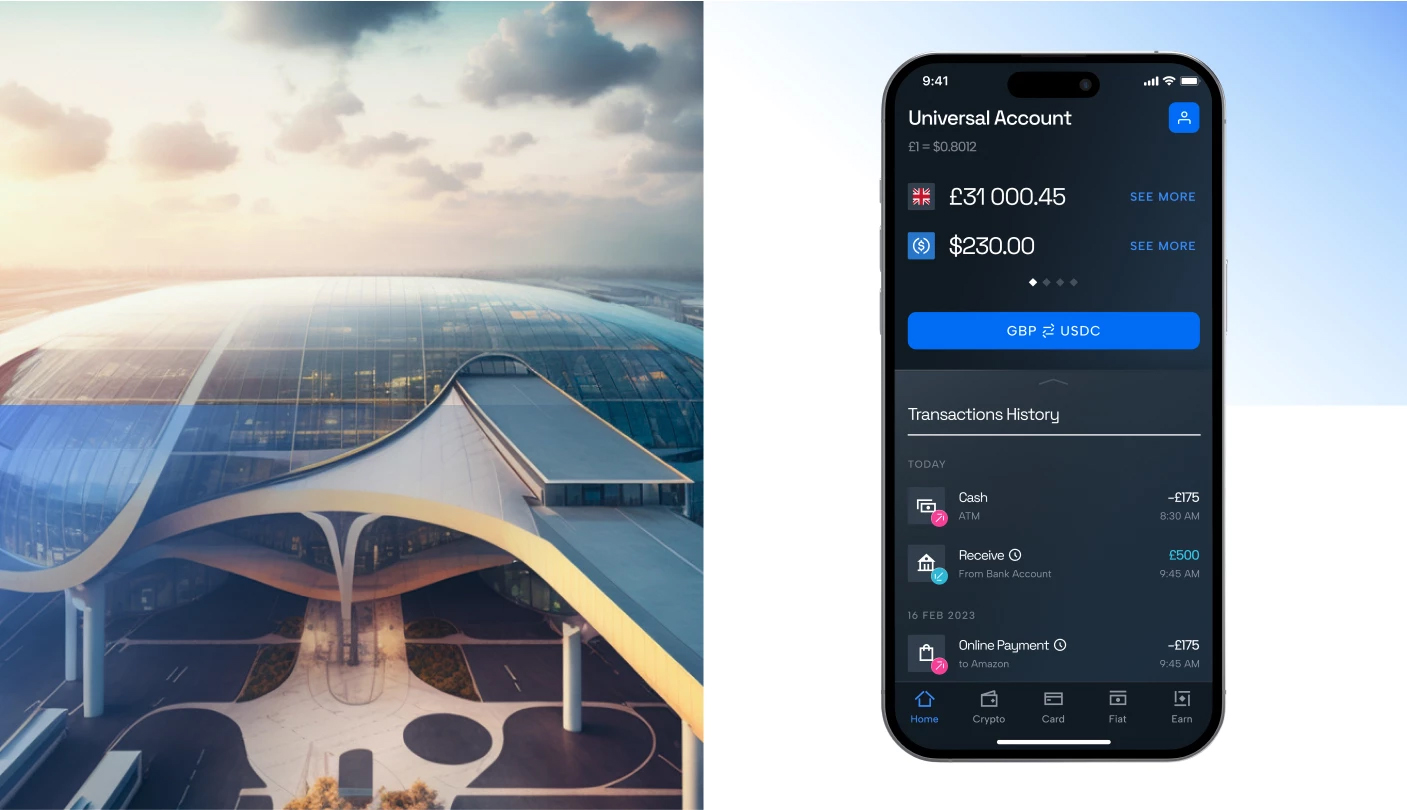
League Design Agency developed the design for the new app for the British neobank Harbour. Harbour acts as a bridge between the world of cryptocurrency and traditional finance. It creates a seamless experience for users who wish to integrate both worlds into their financial portfolio. Just as transport hubs make the world more accessible, Harbour does the same for cryptocurrency. Different modes of transport can move in parallel, avoiding unnecessary transfers and saving money and time. Similarly, Harbour accelerates the integration of new opportunities between the crypto and banking space.
Design Goals
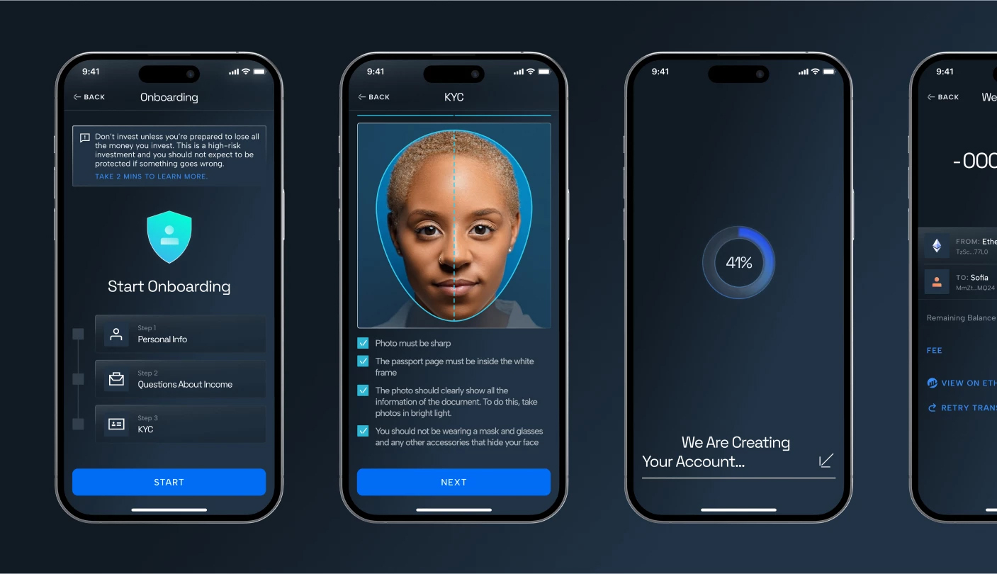
To develop an MVP version of a cross-platform mobile app that meets Harbour’s high standards in innovation, security and user experience. To design a UX logic that ensures intuitive use and flexibility in implementing new features.
Concept
The main idea is based on 3D graphics that visualize the principle of a transport hub. Just as different types of transport meet at a hub, our app becomes the meeting point for cryptocurrency and traditional finance. Through meticulously crafted 3D visuals, we not only decorate but also explain the processes and functions of our product in detail. Using intuitive and simplified interface elements, similar to those used in smartphones, we ensure the convenience and accessibility of the digital service. The use of glass not only adds aesthetic appeal but also symbolizes transparency and technological sophistication, which are key principles of transport hubs.
The foundation of Harbour’s mobile app design is the brand identity we previously created. Glassmorphism and geometric shapes are used to visualize this concept, creating a sense of transparency, order and innovation. The design philosophy is based on minimalism, clarity, and intuitiveness, enabling users to quickly and easily interact with the app’s information and features. It’s like a guide that provides the freedom to navigate between the worlds of cryptocurrency and traditional finance, offering a new way of movement in a new world.
Target Audience
Our target audience includes three main groups: Crypto Influencers, Crypto Users and Crypto Interested. Crypto Influencers are experienced users with deep knowledge in DeFi (decentralized finance) who face challenges in managing crypto assets across different platforms and seek security and ease in converting cryptocurrency to fiat money. Crypto Users are those who hold crypto assets but find such investments risky, encounter interface difficulties, and desire reliability and low fees. Finally, the Crypto Interested group consists of young people interested in cryptocurrency as an investment but hesitant due to risks, yet eager to earn easily and stay updated on financial trends.
Graphic Techniques
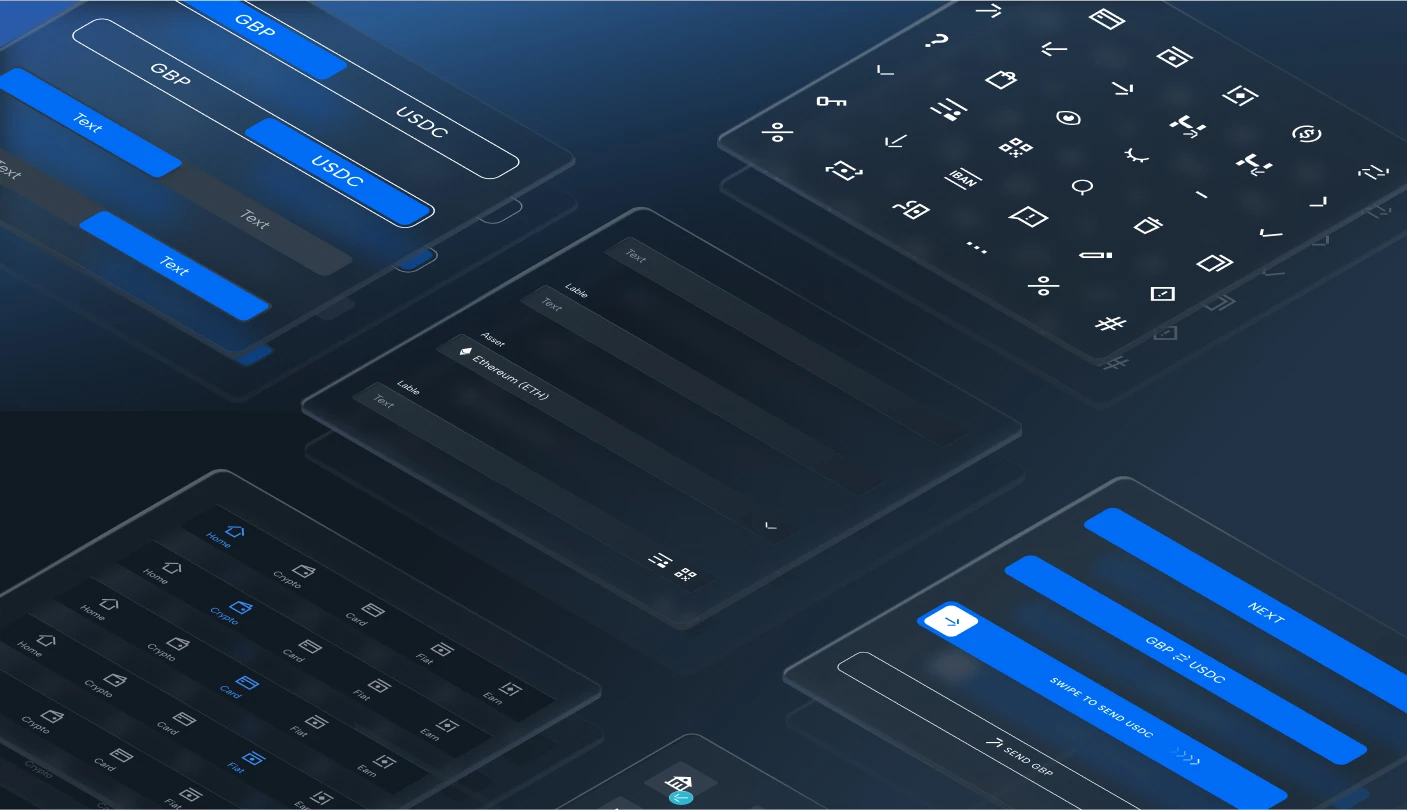
We used glassmorphism to create a sense of transparency and glossy surfaces that reflect the structured nature of modern transport hubs. Geometric shapes with minimal rounding resemble angles, adding clarity and order to the design.
Typography
The use of Space Grotesk and Albert Sans fonts continues the brand’s tradition, ensuring readability and aesthetic integrity.
Color Palette
Through colors, we depict the future with metallic and glassy reflections of transport hubs. Our main approach is gradients, which we apply to backgrounds and graphics. The main theme is dark, with a primary blue gradient. Sometimes, we use a white theme with less blue. The gradients consist of two different yet close colors to convey the multifaceted nature of reflections. They are semi-transparent and quite light, similar to how glass shines. Despite the bright colors, we make them nuanced through transparency. The gradients and dark theme, key in the brand identity, are retained in the app design, adding depth and reflecting Harbour’s technological nature.
Copywriting
The goal was to create a sense of control and security for the user through a concise, simple, and open tone of voice. The app’s language demonstrates Harbour’s wisdom and intelligence, highlighting the uniqueness of its features.
Decorations
Medium-detail icons and geometric shapes create a visual hierarchy, guiding users to important interface elements. Lines and linear arrows help visually separate key subsections. We also used rounded buttons to contrast with the geometric shapes in the interface. A minimalist horizontal scrolling ensures quick familiarization with the functionality.
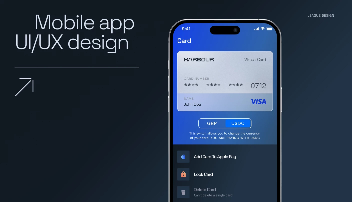
Features
The «Exchange» feature is key, providing a quick exchange between fiat and cryptocurrencies without the use of additional services, differentiating Harbour with its clarity and accessibility. Competitor analysis showed that most are geared toward users with basic crypto knowledge, so Harbour focuses on providing an advantage for a broad spectrum of users.
Special attention was given to bank card management, allowing users to easily switch between them. The Harbour mobile app is more than a regular banking app; it’s your personal financial navigator, guiding you through the world of finance with unprecedented convenience and innovation. It turns every transaction, every financial decision into a step towards better understanding and managing your assets.
 League Design Agency


 Copy link
 facebook
 WhatsApp
 Twitter
 instagram
 telegram
