


VSNS voluntary organization restyling
CF.Digital made restyling for one of the UK’s largest voluntary organizations – Voluntary Support North Surrey (VSNS).
Task
Voluntary Support North Surrey (VSNS) approached us with a rebranding request. Despite operating locally in Surrey, they have been a well-known organisation in the UK for many years. VSNS focuses on supporting other charities, volunteering organisations, and attracting volunteers. Therefore, they operate in both the B2B and B2C markets.
They received a request to refresh their identity and communication as they were no longer aligned with modern trends, and their corporate materials were not consistent across their varios channels. Their goal was to systematize everything and create a branding approach that aligns with VSNS’s values and addresses their business objectives, including:
Attracting more volunteers, which is a challenge considering people’s fatigue after two years of COVID-19.
Appealing to young volunteers, which is an even more difficult task.
Idea
They conducted a comprehensive analysis of VSNS, covering their current identity, market position, reputation, feedback, and business processes. It became evident that their target audience is relatively conservative, as Surrey represents the classic English aesthetic. Since the organization has no plans for territorial expansion, they needed to find a solution that resonated with the local community while adhering to modern branding standards.
VSNS enjoys strong recognition in the local market, so any changes should not cause undue stress among the audience. Their goal was to maintain brand awareness while transforming it into a more contemporary look. In other words, the new identity should be an evolution of the existing one.
However, an identity is more than just fonts and logos. It serves as a versatile tool for creating brand awareness across different channels and facilitates the easy and quick development of communication materials.
Decision
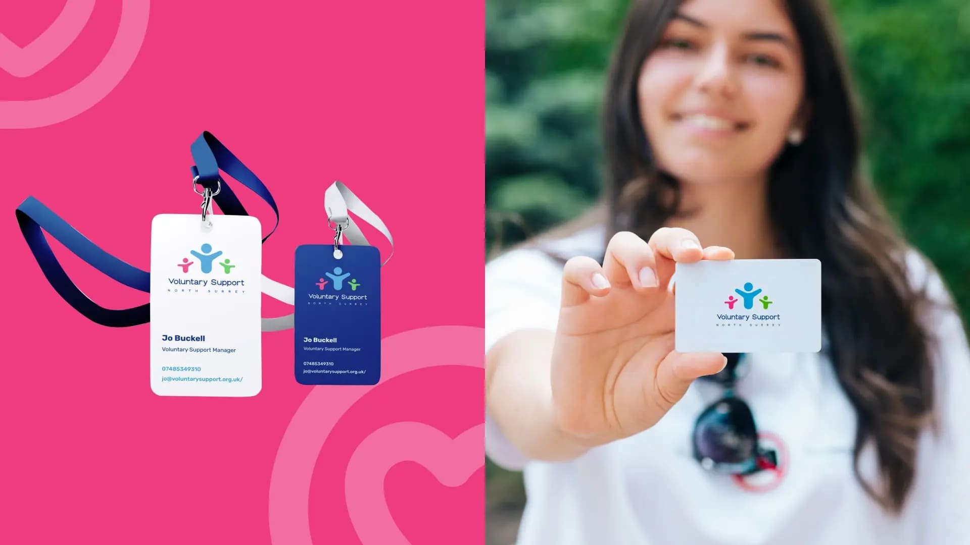
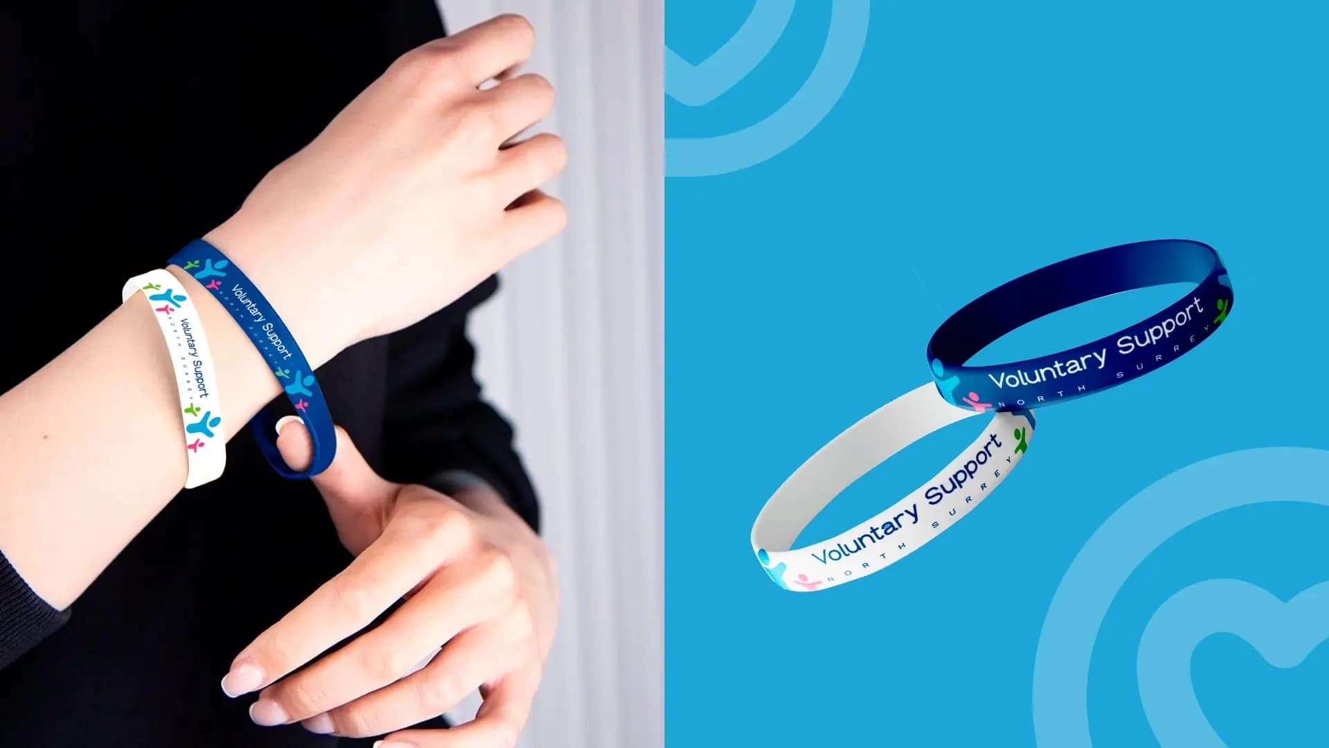
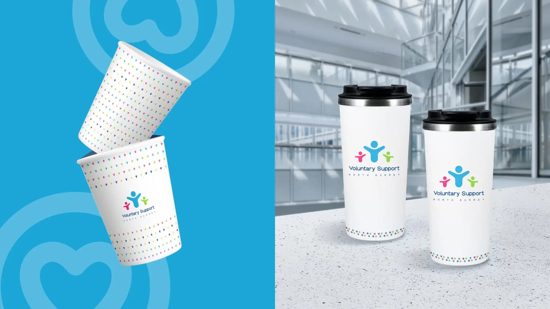
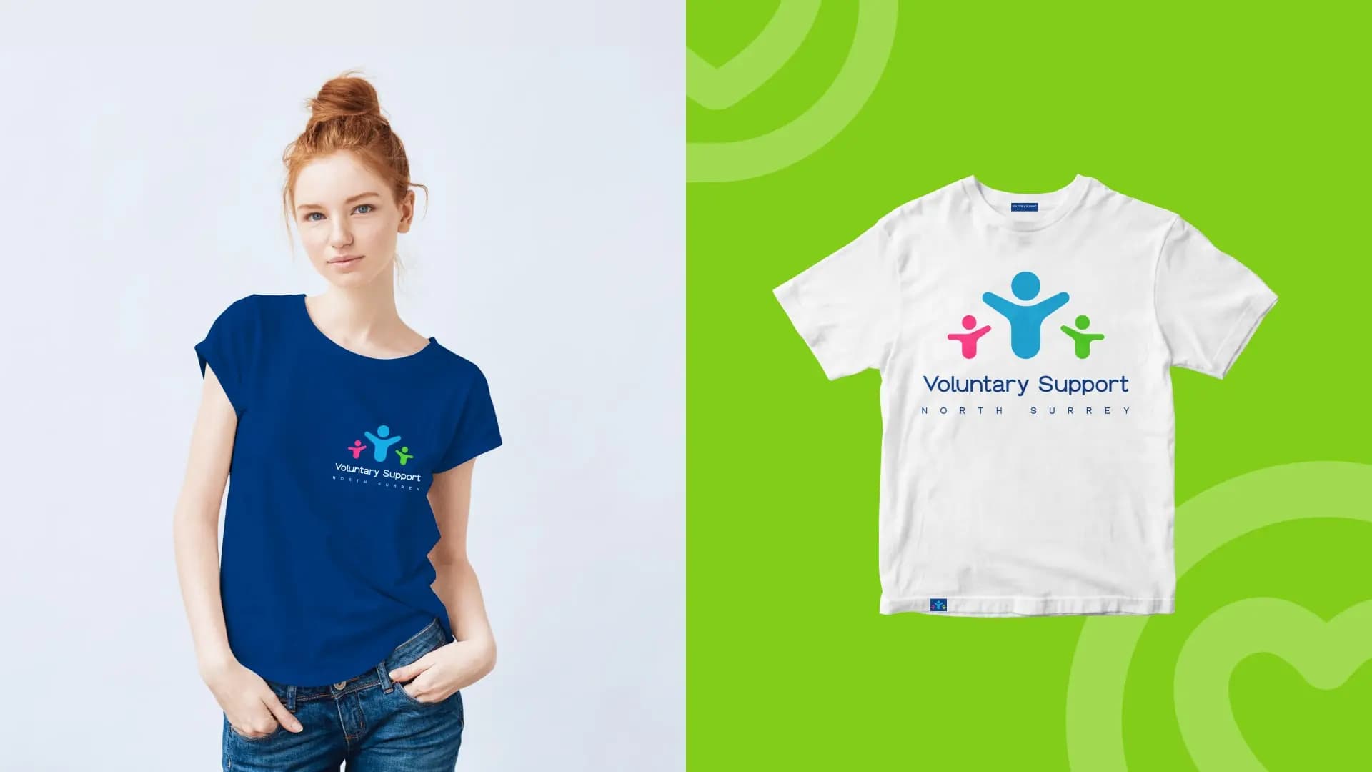
They decided to retain the essence of the current logo but gave it a restyled appearance. They selected new fonts and introduced brighter colors. The existing slogan was kept intact, as it accurately conveys what VSNS does and is well-known among the current audience. Additionally, they created icons representing the organization’s eight main areas of activity. These icons can be used both independently and in combination, serving as recognizable design elements.
They applied the new style to a range of promotional materials, including leaflets, banners, bookmarks, t-shirts, bracelets, and of course, social media. To engage the younger audience, they added inspirational stickers, which have been particularly well-received.
Result
They presented their upgrade at a quarterly meeting of charity organizations and received an overwhelmingly positive response. With renewed inspiration, they continue to strengthen the VSNS brand and look forward to sharing their future accomplishments.
 CF.Digital


 Copy link
 facebook
 WhatsApp
 Twitter
 instagram
 telegram
