


White Rock Bear Shelter identity
Leo Burnett Ukraine created the new identity of White Rock Bear Shelter. The agency has long been collaborating with the Save Wild Foundation, which conducts the rehabilitation of bears and aims to change the established consumer attitude towards wild animals.
Background
Hundreds of wild bears in Ukraine are kept in captivity by circuses and owners of large restaurants for profit. They are forced to entertain people. and, of course, these animals must be saved. But! When it comes to social projects, they always hear too many «but.» So, they decided to change «but» to «and.»
To draw attention to this issue, they created a vibrant logo for the bear shelter «White Rock”. Here, wild animals receive help, and people get to know the world of animals. specialists help rescued bears during rehabilitation to learn or remember what it’s like to be a real bear: searching for food, feeling grass under their paws, diving into water, digging dens, hibernating in winter, and having typical bear leisure.
With the aim of changing the established consumer attitude towards wild animals, «White Rock» doesn’t accuse people but tries to persuade them. Through words, actions, positive, and understandable images, they aim to create new lasting associations in people’s minds between the world of wild animals and feelings of respect and love so that more and more people become ambassadors of the idea of preserving wildlife.
Logic
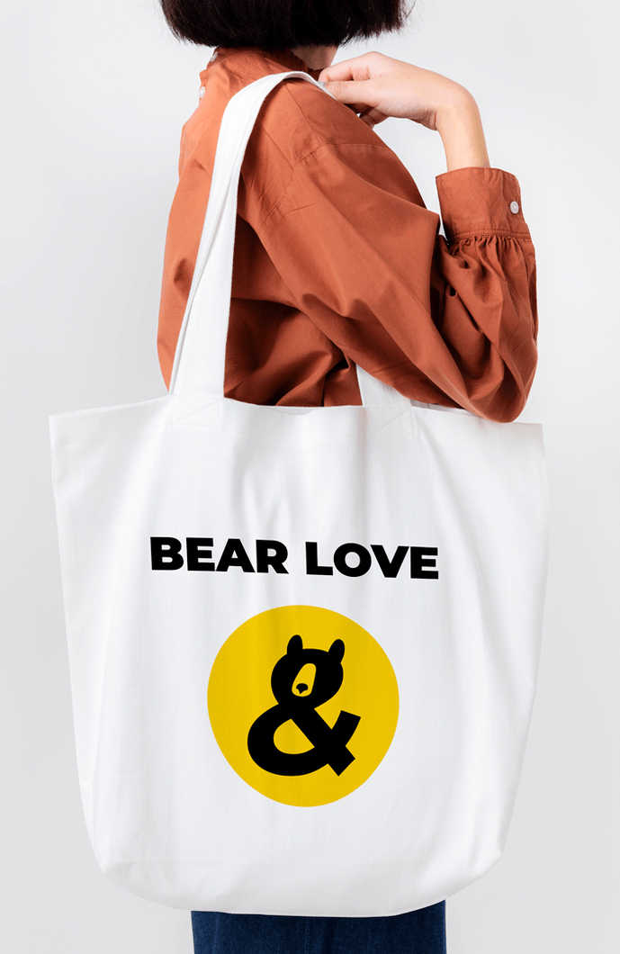
in places where bears feel calm and relaxed, they sit in funny poses that often resemble an ampersand (&). Using this symbol as a basis, they created a new vibrant logo for the bear shelter «White Rock.» The purpose of the shelter is to rescue bears suffering from human cruelty. Therefore, they applied the created logo in creative communication, using the ampersand itself in messages. For example, support & donate, save & care, love & respect, explore & protect, and even celebrate & donate.
Idea
The symbolic part of the logo combines the image of a bear in a characteristic playful pose and the symbol «&» (ampersand). Because in rescue stories, there always has to be an «and». For example: «we saved bears, and we need your help». «you love bears, and you’re ready to donate to support them». So, the bear remains a constant in the logo and can serve as a conjunction in messages for further brand communications.
The basic colors of the logo are energetic yellow («honey happiness») and saturated black («black nose»). This combination can be classified as «signal colors». Thus, the logo will undoubtedly attract attention and be memorable.
In addition, they have created a merchandise line called «bear love». it’s a wordplay that literally translates to «carry love» or «wear love», but «bear» in english also means a bear, for sure. Moreover, the merchandise line includes items that can be physically worn, such as shoppers, t-shirts, mugs, and more. so, let’s bear love for brown bears into this world together!
 Leo Burnett Ukraine


 Copy link
 facebook
 WhatsApp
 Twitter
 instagram
 telegram
