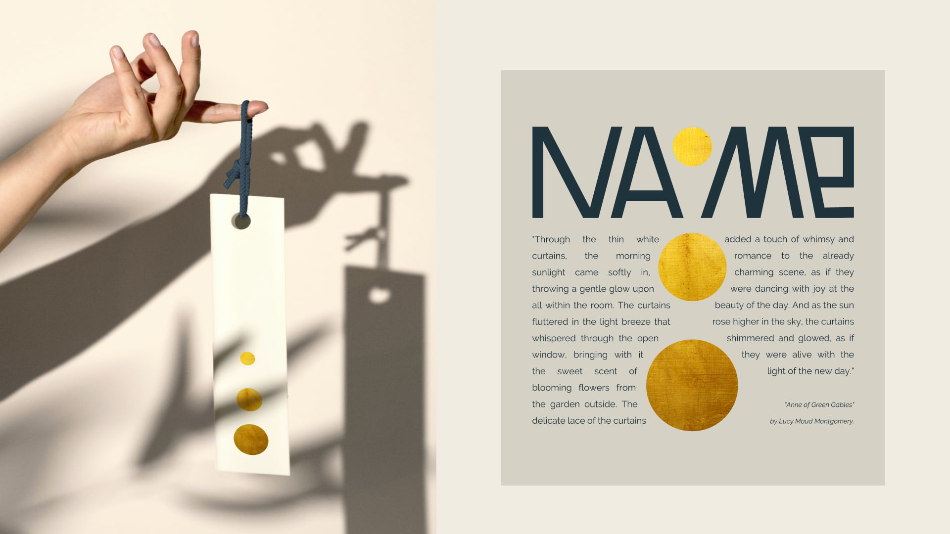
The identity of the American curtain brand Naome
Rocketmen agency developed the name, logo and identity for the American brand of curtains. The main challenge was that curtains were perceived as a thing of the past in the US. Therefore, the agency decided to show its uniqueness, by making curtains a designer item. This is how a dynamic logo appeared, the main character

New Sorbiforce brand creation
Aprostir marketing agency joined the creation of the new Sorbiforce brand and developed the branding and the landing page for it. Sorbiforce is a company of incredible individuals who have created the world’s first battery without the use of metals and toxic substances. The main task was to present the invention to the public and
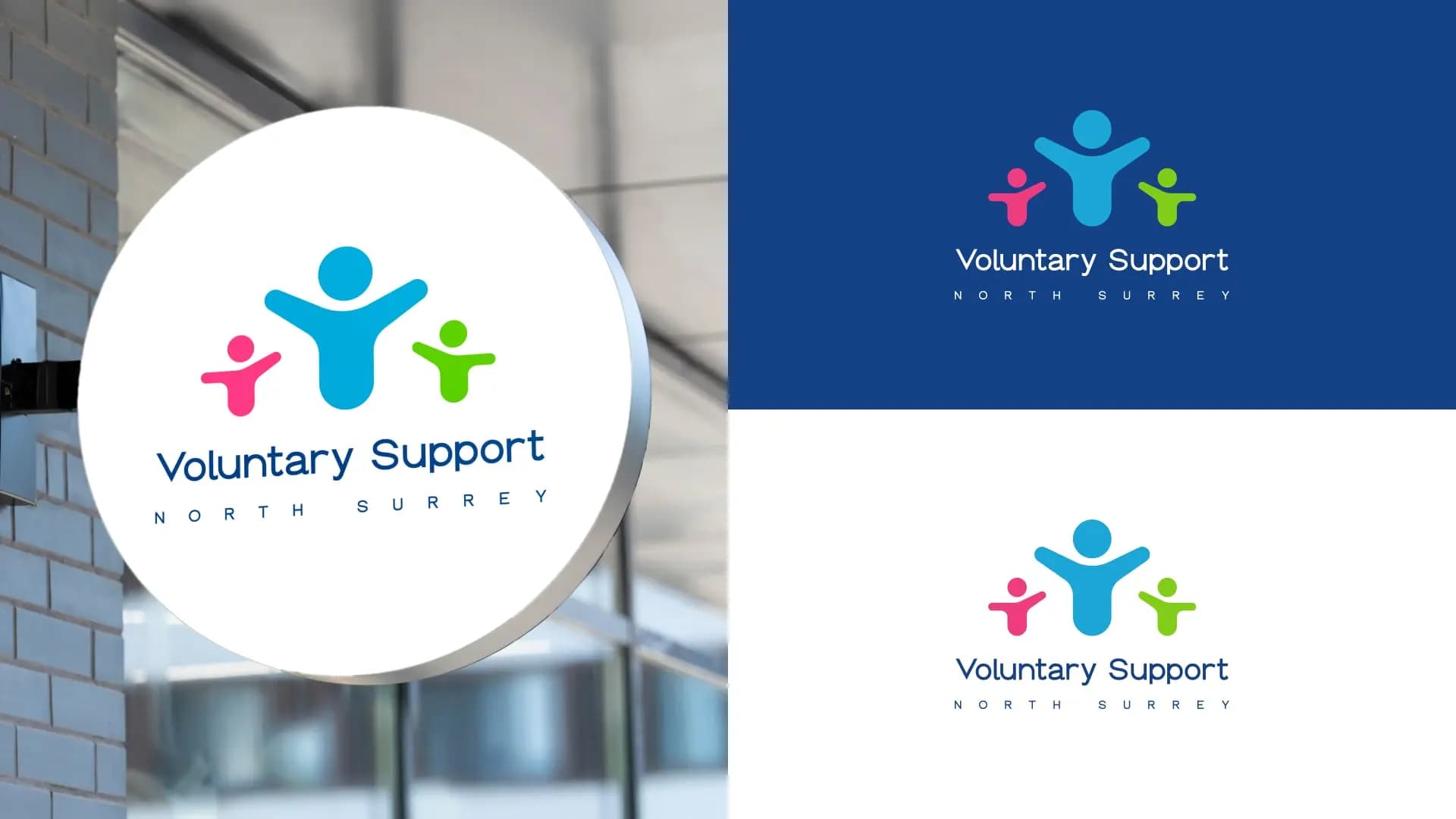
VSNS voluntary organization restyling
CF.Digital made restyling for one of the UK’s largest voluntary organizations – Voluntary Support North Surrey (VSNS). Task Voluntary Support North Surrey (VSNS) approached us with a rebranding request. Despite operating locally in Surrey, they have been a well-known organisation in the UK for many years. VSNS focuses on supporting other charities, volunteering organisations, and
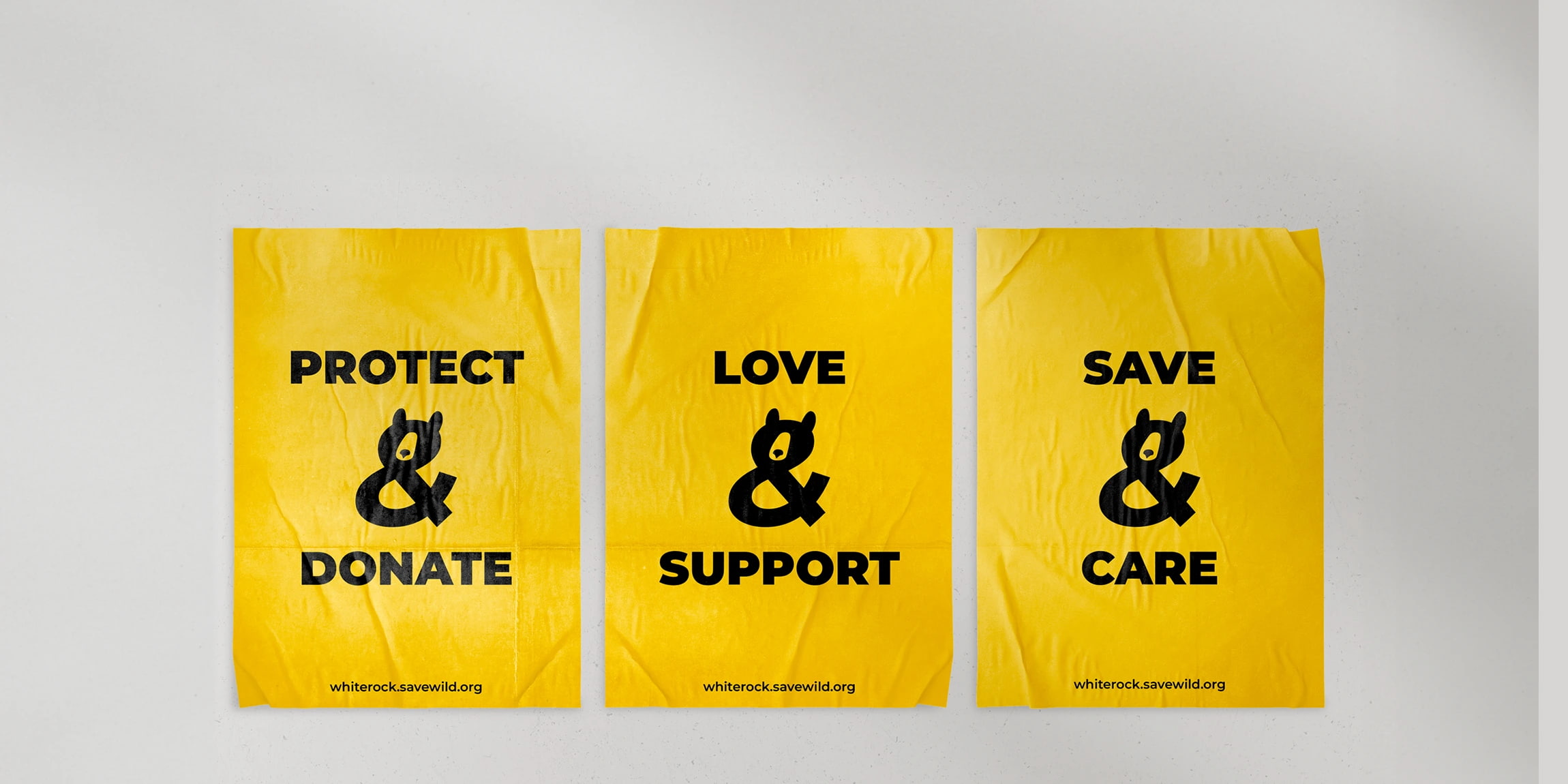
White Rock Bear Shelter identity
Leo Burnett Ukraine created the new identity of White Rock Bear Shelter. The agency has long been collaborating with the Save Wild Foundation, which conducts the rehabilitation of bears and aims to change the established consumer attitude towards wild animals. Background Hundreds of wild bears in Ukraine are kept in captivity by circuses and owners

Packaging design for chips from Uzbekistan
Brain Tank has created packaging design for the Cheers chips brand from Uzbekistan. To achieve this, they decided to find a real chef for the chips to present them as a haute cuisine dish and emphasize their naturalness. Which trigger to use to attract consumers’ attention to the product? How to answer the question of
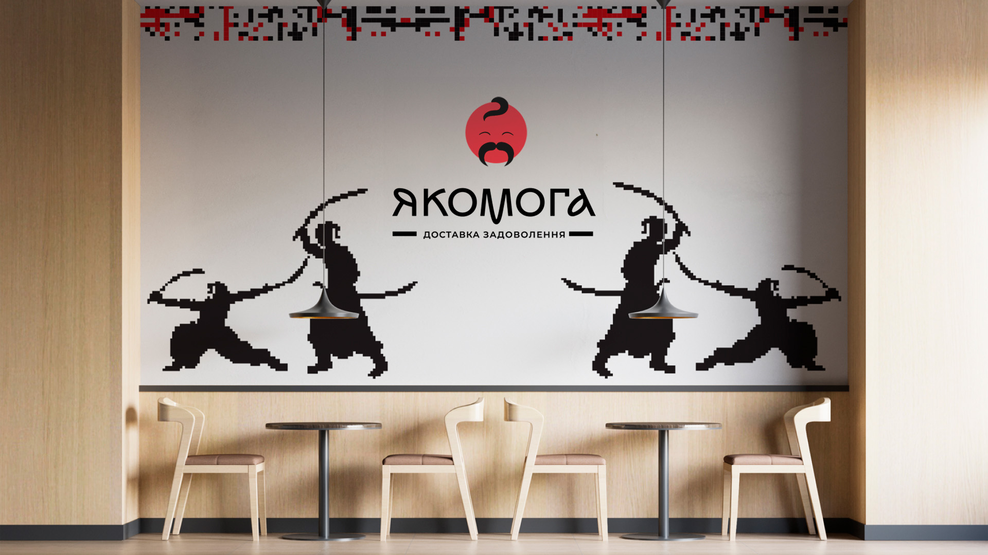
Brand creation for Yakomoga Sushi
ZOND agency created a brand for the Ukrainian company specializing in Japanese cuisine – Yakomoga Sushi. In the name and identity, they conveyed the Ukrainian DNA of the brand and Japanese authenticity. After all, Yakomoga sounds Japanese, but it’s a Ukrainian word that means «As much as possible.» Yakomoga Sushi is a company specializing in
Identity for the new PAYANT payment system
FBA branding agency created a unique identity for the new PAYANT payment system. The project was created on the basis of FAMA PROF CONSULTING.The idea and mood of the brand, a corporate block, business documentation, souvenirs and payment cards design, a number of visual communications and much more were developed. An invisible assistant. PAYANT payment


