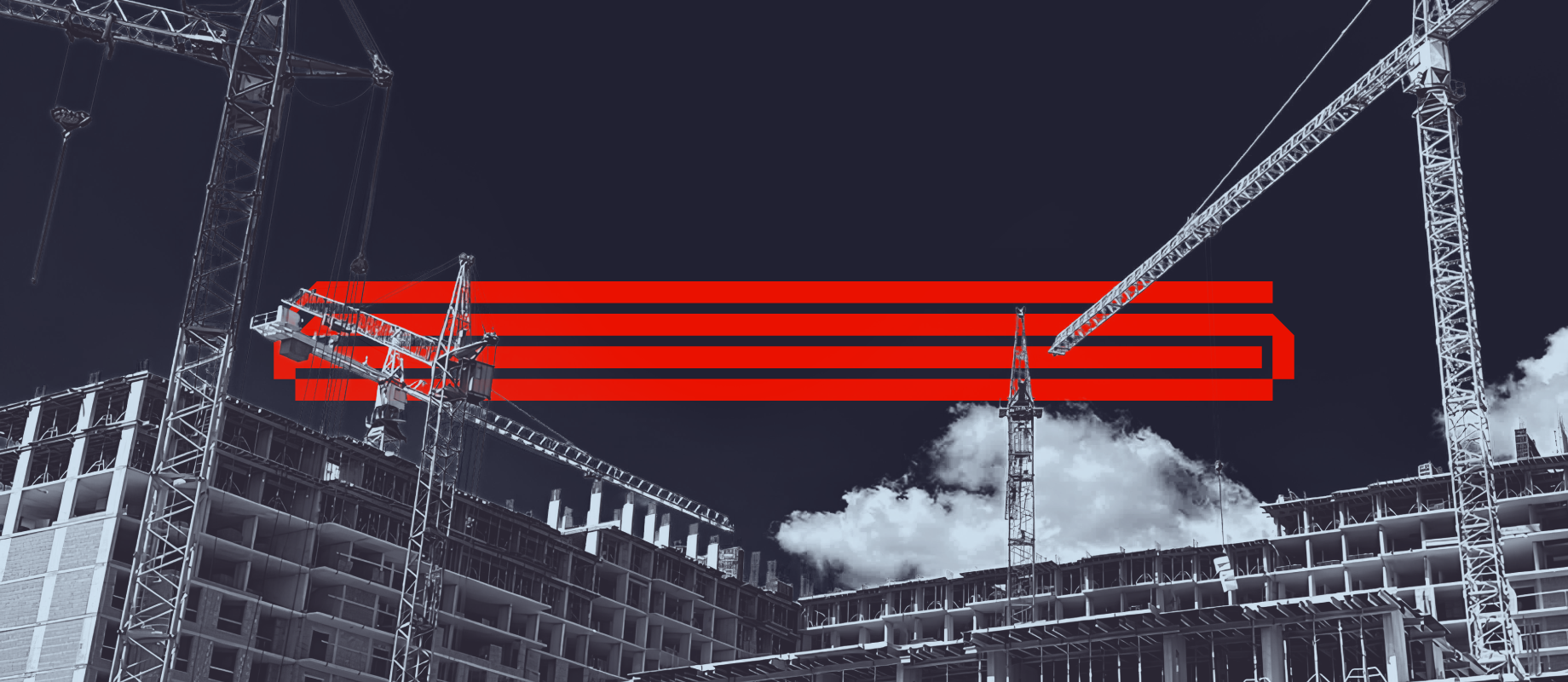
«Concrete-Strong» Rebranding for a Construction Company
Breaking away from industry standards and showcasing ambition—this was the challenge set by Budhub, a leading formwork solutions company from Lviv. Inspired by their bold vision, aprostir agency translated this energy into a striking rebrand.
Logo
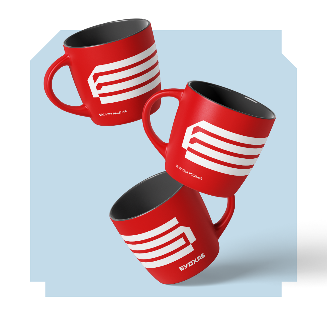
The new logo is a geometric Cyrillic letter Б, mirroring the structure of formwork. We emphasized the brand’s signature red color, making it even more vibrant. To clearly communicate Budhub’s expertise, we placed the descriptor “Formwork Solutions” beneath the logo—concise and to the point.
Brand identity
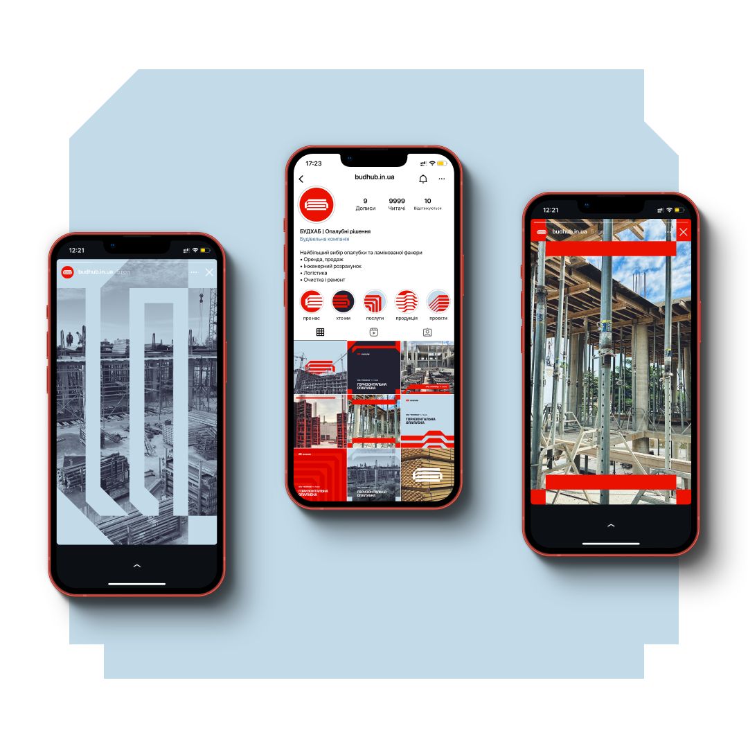
The logo’s structure became the foundation for the brand’s visual identity—flexible, dynamic patterns that seamlessly adapt across different things. From branded hard hat, t-shirts, and vehicles to notebooks and cups. Budhub now stands out with confidence, brightness, and a modern look that commands attention.



 Copy link
 facebook
 WhatsApp
 Twitter
 instagram
 telegram
