

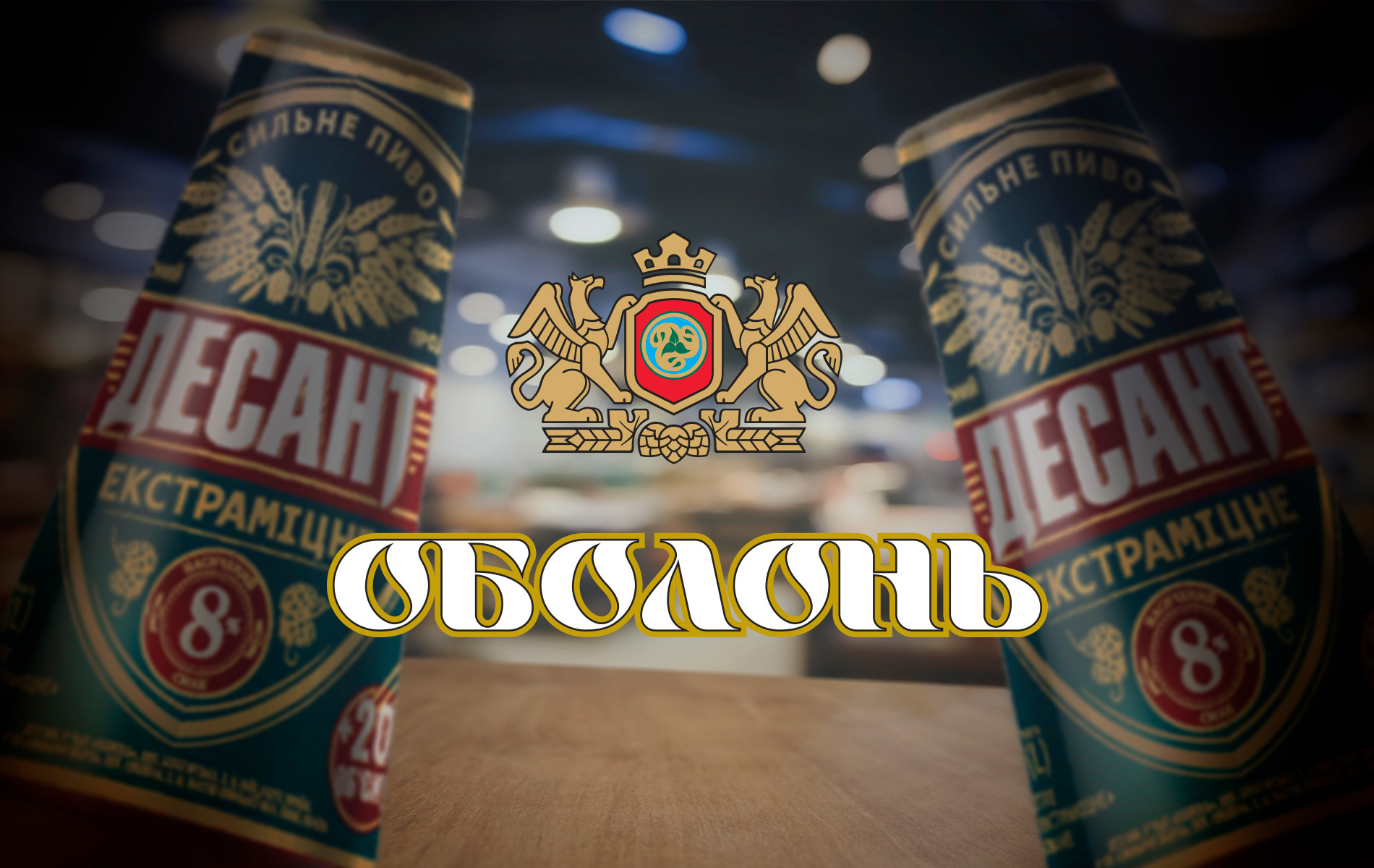
Redesigning the label for «Desant» beer
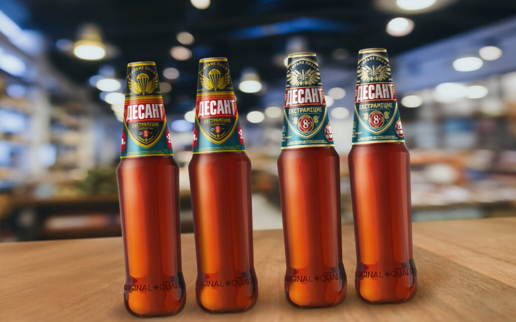
Brain Tank redesigned the labels of «Desant» beer, a brand of the Ukrainian company «Obolon.» The audience perceives the label as outdated and, at the same time, is not ready for noticeable changes in the design and complete removal of its militaristic color. So, the brand needs to completely update the design without changing it.
The team all look for familiar products on the shelf based on a familiar color pattern, in other words, a pattern of spots with an approximate image of the logo. And when a brand wants to refresh the label without losing recognition, this set of spots becomes the basis of the design. The most interesting thing is that this is no less complex and exciting work than creating a completely new label, as in the end, everything should look very simple, as if the brand has always looked like that.
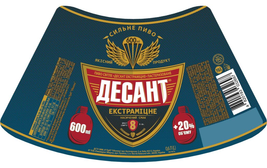
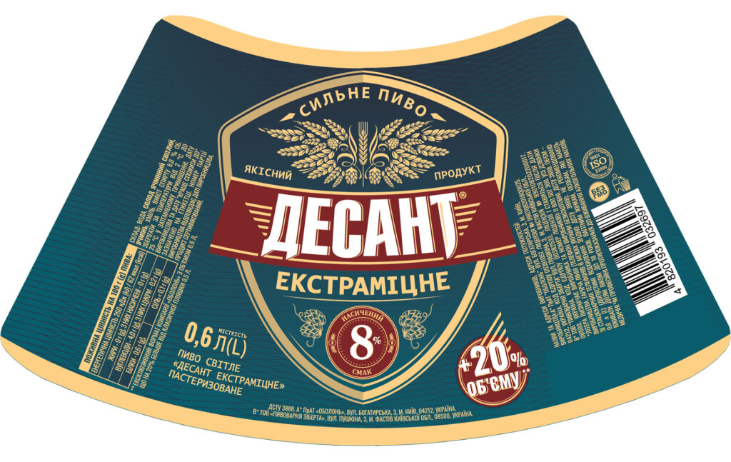
So, «Desant 2.0» in the new visual codes has invisibly changed for consumers:
~ the background palette and red logo tags,
~ the brand pattern,
~ fonts of technical information to a more modern style,
~ the beer strength marker is now a noticeable aesthetic symbol that consumers will find on the shelf,
~ the composition with a parachute on the product composition in the form of wings made of malt and hops with the imitation of a coat of arms in its heart.
 Brain Tank


 Copy link
 facebook
 WhatsApp
 Twitter
 instagram
 telegram
