

New identity for Intertop
Taktika creative agency has developed a new dynamic visual style for communicating the Intertop clothing store.
Taktika was tasked with creating a design system that is easy to perceive and functional, without becoming monotonous. Diversity is crucial in fashion communication since collections and styles are constantly changing or can become repetitive over time. Therefore, it was necessary to create distinctive elements while also leaving room for continuous additions.
The solution for dynamism was found in corporate fonts. Specifically for the brand, they created the Intertop Display Regular, Intertop Text Regular, and Intertop Text Bold typefaces. They added alternative characters for some letters, allowing these custom characters to mix with standard ones in texts, making the identity even more expressive and diverse.
Since Intertop operates in multiple markets, the agency immediately thought about font usage and adaptation in Ukrainian, Polish, English, Kazakh, and Uzbek.
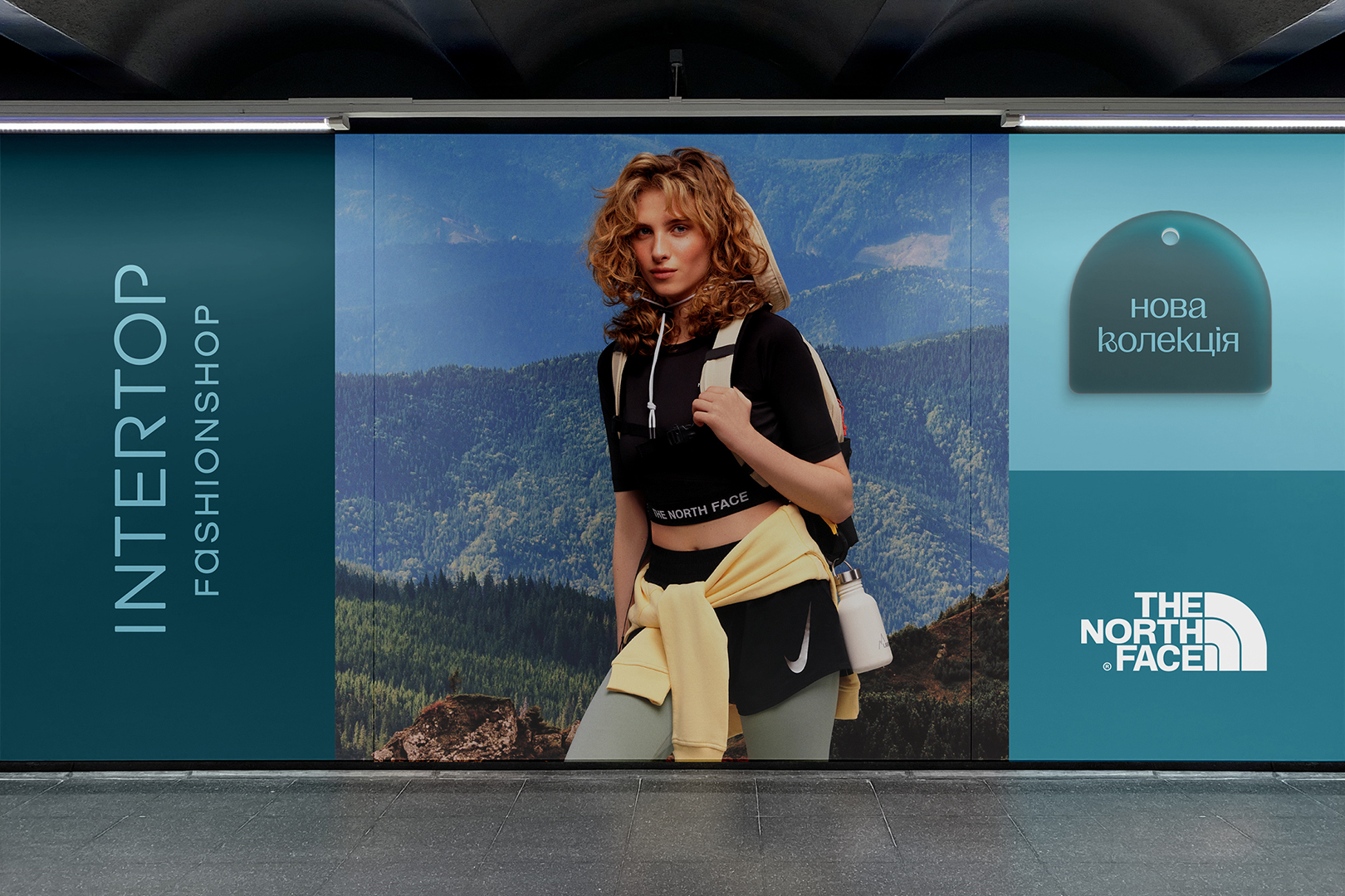
Taktika drew inspiration from the colors already present in the offline store interiors and transferred them into the digital realm. They created a palette for the brand with primary colors and shades that can be mixed and used to create layouts in monochromatic tones.
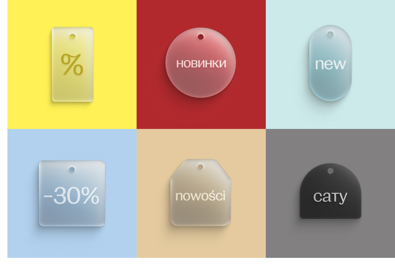
The agency’s team built the identity from a simple block system, which allows for the creation of new layouts each time while remaining within a consistent concept. They completed the identity with special brand elements: 3D tags made of transparent glass and neon forms. These elements will draw attention to discounts, promotions, and special offers.


 Copy link
 facebook
 WhatsApp
 Twitter
 instagram
 telegram
