
The identity of the American curtain brand Naome
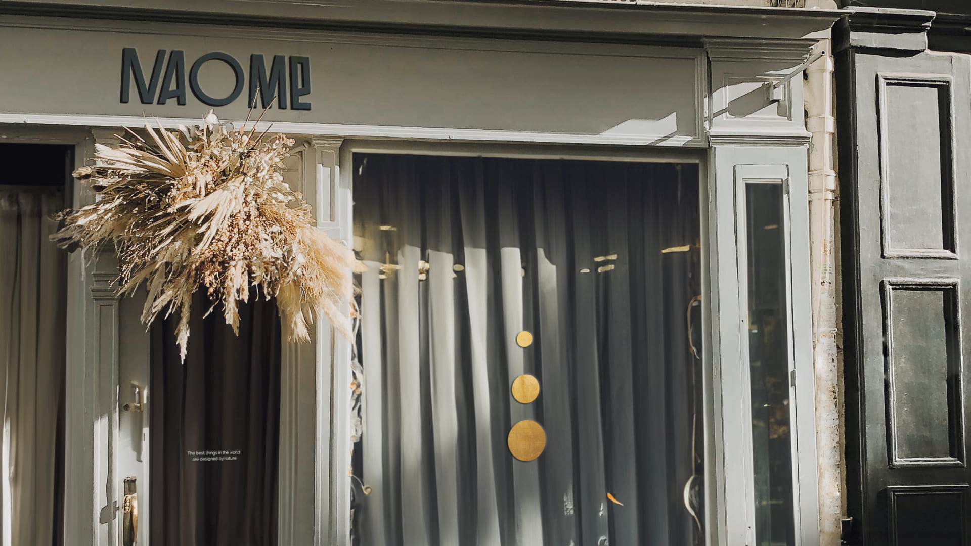
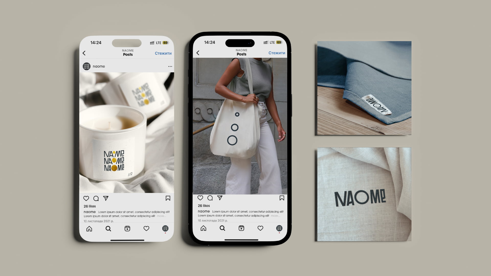
Rocketmen agency developed the name, logo and identity for the American brand of curtains.
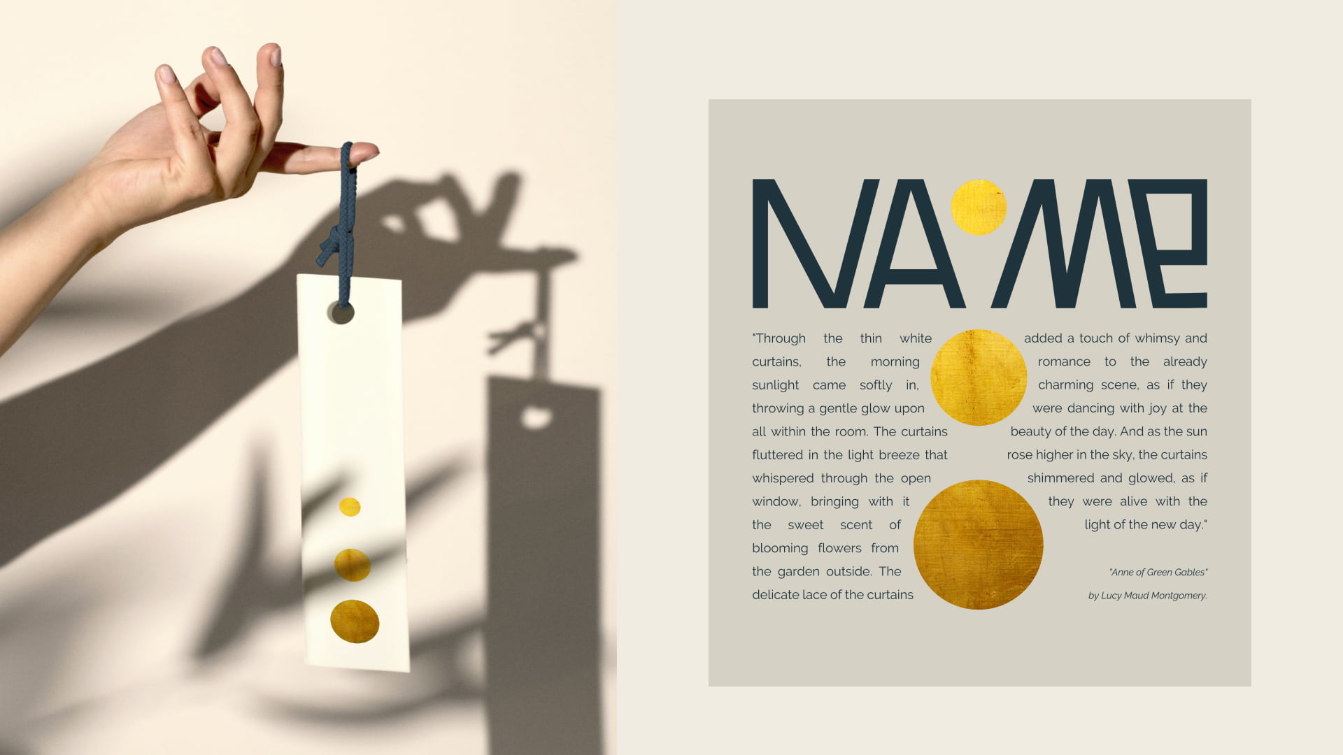
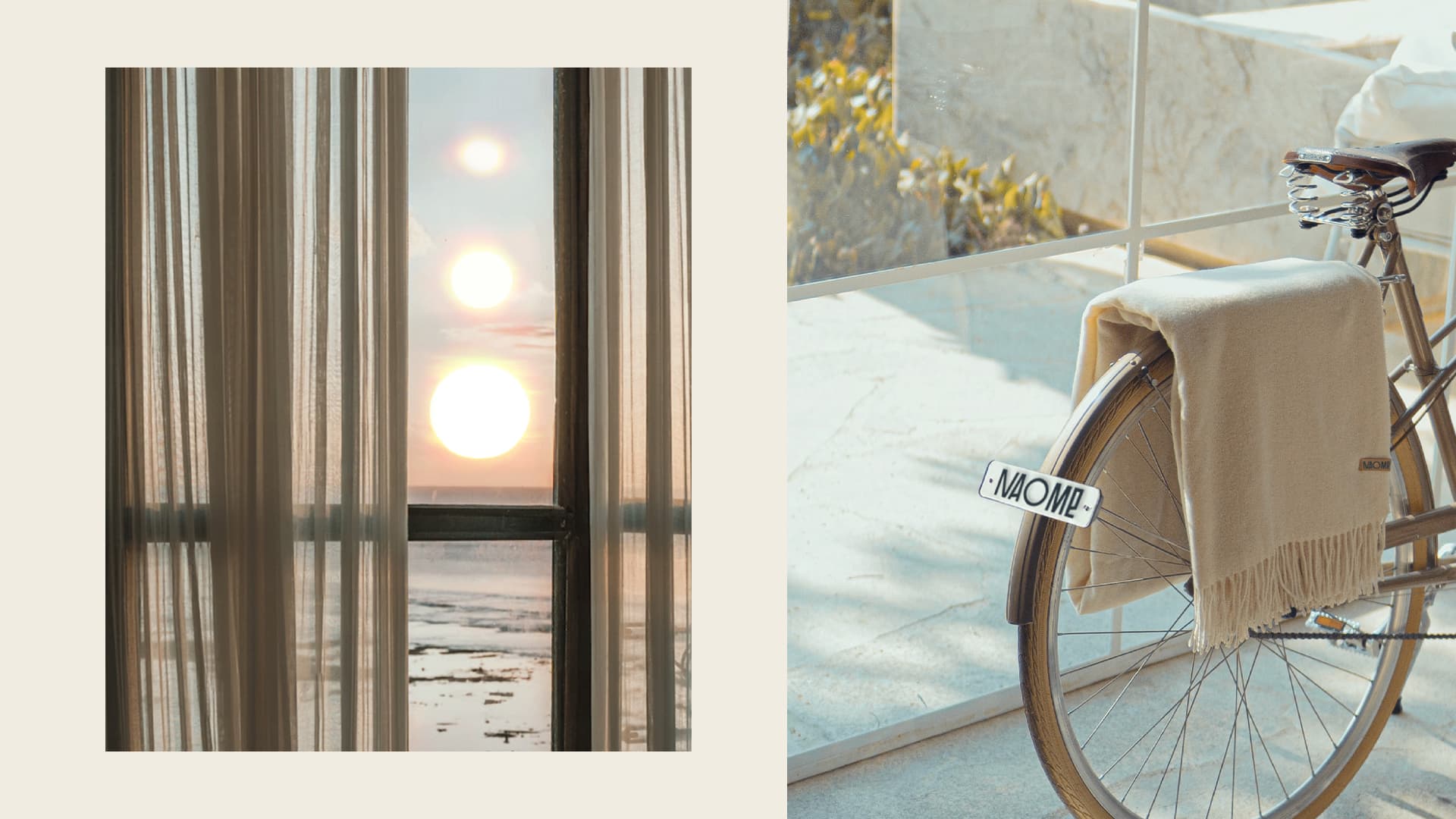
The main challenge was that curtains were perceived as a thing of the past in the US. Therefore, the agency decided to show its uniqueness, by making curtains a designer item. This is how a dynamic logo appeared, the main character of which is the sun, which changes phases during the day. Trend elements in the logo, elegance, and aesthetic gold details created a feeling of exclusivity of the brand.
Naome is a manufacturer of natural home textiles in the USA.
The difficulty was that curtains were perceived as outdated in the US. Therefore, it was necessary to convince consumers that this is a stylish element of the home.
For this, the agency made a logo that tells about the naturalness of the brand. The phases of the sun during the day, natural colors, and aesthetic golden details were used in the logo. The lines of the letters in the logo imitate the folds of fabric when the curtains are opened or blown by the wind.
For that, the agency was inspired by fashion houses named after their founders. And they put the name of the creator of curtains made of natural fabrics — nature — in the name of the brand. Naomi — Nature + Home.



 Copy link
 facebook
 WhatsApp
 Twitter
 instagram
 telegram
